Here is an example of a Digital Pack, used by Ghostpoet when releasing his Album 'Peanut Butter Blues & Melancholy Jam'. It uses a CD style template. An extremely close up and blurred vintage photograph appears to have been used for the background of the digipak upon the reverse of the CD case. This may have been chosen for use as it relates to the Star Image that has been created by the artist. The font used for the Artists name is White, which contrasts with the colour of the background image. Therefore making it stand out to the audience. The title of the album has used two different tones of green. This choice in colour is very similar to that used in the design of one of Ghostpoets adverts/posters. This poster can be seen below alongside the the digital pack. This similarity may have occurred on purpose, because it allows for links between different platforms of media to be made. The public may therefore associate these colours with the artist, also contributing to the star-image.


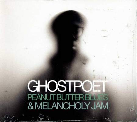
Above, both the actual CD and the front of the digipak can be seen. The image of the artist used on the front of the digipak is extremely blurred, once again contributing to the element of mystery when it comes to the image of the artist. This also links with the reverse of the digipak as a similar effect is used there, with the close-up background image. The front of the digipak follows the same colour scheme as the reverse. The actual CD print also does follows this. The monochrome colours of the background image, contrast with the white text used on the titles name. Although the majority of the artists image cannot be recognised, a small amount of his glasses can be. Ghostpoets spectacles heavily feature within his star image. This is because of their size and uniqueness. He can be seen wearing them in some other images below. This allows the target audience to recognise him because of these glasses, despite the fact that the rest of the image is much less recognisable.
Due to the image of Ghostpoet on the digipak only showing him, and not featuring anybody else, it can be easily recognised that he is a solo artist rather Ghostpoet being a name for a band. The fact that he is displayed in digipak the to be blurred and mysterious fits with his name, as he almost appears to be a Ghost upon the front of the digipak. The CD's print is split into two different designs. A vinyl image has been used on a small section of the CD print to once again give a vintage feel to the overall digipak. The track-listing has been displayed on this platform of media as well. This is something that we could consider when designing our digital pack.
No comments:
Post a Comment