Below is a link to a presentation that has been created in order to briefly summarise the processes involved within the production of the music video and ancillary texts. It has been made using Prezi, which is a media platform that allows you to design interactive and advanced presentations.
http://prezi.com/sye2k1fq63kg/evaluation/
Sunday, 1 April 2012
Thursday, 1 March 2012
Evaluation.
In what ways does your media product use, develop or challenge forms and conventions of real media products?
In terms of the music video, it could be said that this product has used the forms and conventions of similar real media products, as inspiration and such products have allowed us to develop our ideas further than initially planned. An example of this could be when using post-production software such as Final Cut Pro. Some of the effects and filters that we chose to use when editing with this software had been chosen after completing research into similar real media products. Below is a screenshot showing how filters and effects have been applied to our product during post-production, after we had seen them used with other products within the market. The image shows how the RGB balance was adjusted in order to achieve the desired filter that could then be applied to all of the shots throughout the music video.


By using effects that are common within the Indie genre, and that are often applied to similar real media products, the audience are likely to recognise these effects as connotations of products that they personally prefer if they are fans of the Indie genre. This recognition could potentially lead to them investigating the artist further by watching their other music videos. An example of how the music video imitates these forms and conventions can be seen below. The images show how the commonly used 'sun glare' effect has been used in our music video, also providing an example from a real media product.


Within the production stage of creating our music video, we ensured that we were considering the forms and conventions of real music videos within the same genre. For example, it is very common within the Indie genre to follow an ‘abstract’ and ‘unique’ theme. There are many potential examples of this; however I have chosen two below that I feel are particularly appropriate.
I believe that artists and directors of music videos from the indie genre choose to use an abstract theme as the artists are trying to stand out and become noticed. This is probably the case as they are usually unsigned and are searching for recognition. Therefore if an artist is to use a theme or a reoccurring item or object within their video, then it is highly likely that the audience will fulfil the aim of Peer to Peer marketing that the artist holds. It could be said that the music video challenges the forms and conventions of Indie genre music videos due to its narrative. This is the case as the last scene is particularly different to what is expected or what usually features in similar real media products. The subject of suicide very rarely features within a music videos narrative due to it potentially leading to the audience holding negative connotations with the artist as a result. However it also has a shock factor. This shock factor could lead to the audience telling others about the video, once again causing Peer to Peer marketing. An example of how this is used with similar real media products is Ed Sheeran's 'A-Team'. The video's themed upon the topic of prostitution and drug abuse. This video was pivitol in ensuring that Ed Sheeran became signed, which he did after releasing the video.
In regard to both of the ancillary texts, the advert and digipak, it could be said that these texts use, develop and challenge the forms and conventions of real media products. An example of how the advert has used the forms and conventions of real adverts within the same genre could be the font and text used within the advert. It is very common for the font to be of a white colour and of an oversized format to stand out in the Indie Genre. There are many examples of this which can be seen within my research. It could also be said that the digipak has used the forms and conventions of real Digipaks, especially from the indie genre, as a filter has been used on the front cover of the digipak. During research I found that this was very often the case with similar real media products, for example James Blake’s and Ghostpoet’s Digipaks.
The digipak has also used images that have been taken on location when completing the production process for the music video. This is very rarely the case with other Indie Digipaks and instead images are often used that have been hand drawn or created by artists. Examples of this are both The Cads and Foals. Therefore it could be said that this challenges the forms and conventions of real media Digipaks. I feel that by challenging the forms and conventions, an artist is more likely to stand out to the potential audience as being different to the norm. In respect of the advert it could be said that it challenges the forms and conventions of real media adverts through its lack of cross-media links. This can have a positive impact, however, as the audience may be intrigued to find out more after they have only been given the artists name, song title and release date.
How effective is the combination of your main product and ancillary texts?
It could be said that the combination of the music video and both the advert and the Digipak has been successful and effective for a number of reasons. One example of why this is the case is how all 3 of the products have clear, precise and deliberate links visually from the point of view of the audience. It can be seen by examining the advert that the artist is sitting upon the blue inflatable chair and appears to be playing a guitar. This is also the case with some of the imagery that is featured within the Digipak and also of course within the music video itself. By creating this cross-media link between our products I believe that the audience is more likely to take an interest towards another product of the artists once they recognise the blue chair, especially as it is such a unique factor. On the other hand, it could be said by some that our products could include factors that allow them to stand out from one another, however, after careful consideration when designing the products and after listening to audience feedback it was decided that creating the cross-media links between the products was most important. This is especially true as the artist is relatively new and is not famous, therefore meaning that the majority of the public would not recognise his face and would probably differentiate between products, casting them off as separate promotional campaigns. The image below, is a part of the Digipak. Both of the photographs used to create this part of the Digipak were taken on location when filming for the music video. Therefore, this allows links to be made between the two products.

I believe that due to the use of similar, if not the same fonts, filters, effects and other such software tools throughout all of the products, an effective combination has been created. As the audience will be able to recognise the use of font and its colour and oversized format across all of the products. The stereotypical filter used throughout the Indie genre on a lot of media products to provide a ‘vintage’ effect to the product has been used on both the music video and ancillary texts. I believe that this has allowed the artist to be branded appropriately, and those who see all of the products will probably be able to predict the genre of the artist’s music. This may lead to the audience investigating the artist further and potentially buying or listening to his music.
What have you learnt from your audience feedback?
After we had given a pitch regarding the music video to a class of fellow media studies students, who were also of the same age as that of our target audience, we asked them a number of questions and recorded their answers. From these answers a number of trends were identified and both positive and negative feedback was received. One noticeable trend in the feedback was the vast amount of people who gave a positive review of the decision to use just one character, the artist. At this point we were considering introducing another character to the music video, possibly multiple characters, however, this feedback made it clear to us that the vast majority of our target audience preferred the intimacy of using just one. It was said by a minority that if we introduced more characters then we would have a greater chance of holding the audiences interest. Although we did consider this advice, we felt that the majority were right in saying that it created the desired feeling of isolation by focusing the video solely around the artist. In this instance, I learnt a lot from the audience feedback that was received. The feedback allowed us to make a decision in confidence that the majority of the target audience would be satisfied with the concept of the music video.
The images below show how the audience feedback was used in order to create the atmosphere of the artist being 'isolated' or 'lonely' throughout his journey. Both images are shots from the music video which highlight the artists isolation from everybody around him.


In future, I would gain a larger amount of audience feedback, at more regular points within the production process, of all 3 of the products. I feel that I have learnt a lot from obtaining that initial feedback upon presenting the pitch to the media students, as the feedback contributed to many aspects of the planning and production of the music video. It could have also been beneficial to obtain audience feedback once the project had ended. This would have allowed for myself to gain feedback that I could consider and keep in mind when completing similar tasks in the future. It is for this reason that I shall be doing so, upon completing this evaluation. I have learnt a number of things from the audience feedback. One being different factors that affected the planning of the music video after completing the pitch. Another is that I have realised the need for a greater amount of audience feedback to be completed in future projects.
How did you use new media technologies in the construction and research, planning and evaluation stages?
A huge variety of new media technologies were used throughout all stages of the project. Beginning with the construction stage, different types of computer software were used for this purpose. When we had completed all of the filming that was required for the music video, Final Cut Pro was used in order to use a number of functions and tools that together allowed us to cut, use effects, filters, change of speed, colour manipulation and other video editing techniques. Once the video had been finalised, and we were happy with the result, we had to use another programme in order to export the video file from Final Cut Pro and burn it to a DVD. This programme is called i-DVD. When creating the ancillary texts, different software was used due to a different format of media being at hand. In order to create the advert, Photoshop was used in order to edit a photo that had been taken on location when filming for the music video. This software allowed us to use a filter upon the image which made the suns glare appear more vibrant. This meant we could gain the desired effect that fitted the forms and conventions of the genre. We were also able to place the text, and move it to a position that was most suitable.


The images above show Photoshop and Final Cut Pro being used. In the research stage of the project, I found that using a scanner allowed me to upload pictures and examples of adverts or Digipaks to the online blog. This allowed me to complete research into them and contribute of course to the designs and final products that were eventually created. The online blog allowed me to bring together all of the stages and present them using a new media technology in itself. The evaluation stage was simple to complete, as the screenshots were taken on the Apple Mac computer I had been using for the construction stage. The planning stage involved careful consideration of similar real media products. In order to plan, research had to be completed. Research was completed using physical texts such as magazines, books and newspapers, however, the internet was also used for this purpose. A range of websites were used including Youtube, which allowed us to watch and examine similar music videos of the same genre.
Thursday, 23 February 2012

Monday, 20 February 2012


Wednesday, 18 January 2012
Digital Pack Research - Analysis. (Adele)
 Adele is a British solo artist whose music falls into the Pop genre. The vast majority of her songs follow the theme of loss and love, as can be seen by examining the track-listing upon the reverse of the digipak, with song titles such as 'Lovesong' and 'Hiding my heart'. Therefore it is expected that this would be represented or shown in some way within her digipak to the potential listener. In my opinion this has been done by showing an image of Adele upon the front of the digipak looking both emotional and thoughtful. She is pictured looking down towards the ground, whilst looking both elegant and pretty. The discussed image is presented in monochrome and lighting has clearly been used to brighten
 Adeles face, causing it to subtly stand out from the dark background.
The image used upon the reverse of the digipak is slightly different to that used on the front. I believe that Adele has been pictured looking up at the viewer so that a personal element can be established between the viewer and the artist. It could be said that is seems as if the artist has a story to tell the audience, especially as this picture is located adjacent to the track-listing. The track-listing features the extra element of 'Bonus Tracks'. This is a marketing technique in some ways, as it may have an attractive effect upon the audience or potential customer, as they may feel that they are getting a better value deal when they purchase the album.
The white font that is used on the front of the digipak strongly stands out from the monochrome coloured background. As Adele is a Pop artist and a household name, this is important. If the potential customer sees the name Adele when searching for a CD, it is highly likely that they will recognise the name and will be aware of the music that she has released. Referring now to the back of the digipak, the title of the album is repeated twice, once on both of the vertical edges of the the digipak. It may be the case that this has been done to ensure that if the CD is placed on the shelf in a manor that does not display the front of the digipak, the title will still be on show to any passing trade or potential customers. Although this is assuming that the public will be aware of the title of the album or will not what they are looking to purchase. This therefore relies upon advertising and marketing taking place across other platforms of media.
Remaining on the topic of different media platforms, it can be seen that on the reverse of the digipak a number of website addresses have been included. These include www.adele.tv and www.xlrecordings.com. These sites being Adele's personal promotional website and the record label itself. This is an example of cross-media convergence, which allows the audience to further research the artist which may lead to the purchasing of more releases and/or merchandise. The fact that the layout and design are both of a simple nature creates a mature feeling or atmosphere about the digipak. If it was to be compared to other Pop artists digipak's it would look a lot more tame, due to the lack in bright colours or fulfilled images. I believe that this has been done deliberately to fit the target audience of Adele. This also links with the title of the album, 21. Turning 21 is seen as the coming of age and full maturity. This also happened to be the age of Adele when this album was released.
Remaining on the topic of different media platforms, it can be seen that on the reverse of the digipak a number of website addresses have been included. These include www.adele.tv and www.xlrecordings.com. These sites being Adele's personal promotional website and the record label itself. This is an example of cross-media convergence, which allows the audience to further research the artist which may lead to the purchasing of more releases and/or merchandise. The fact that the layout and design are both of a simple nature creates a mature feeling or atmosphere about the digipak. If it was to be compared to other Pop artists digipak's it would look a lot more tame, due to the lack in bright colours or fulfilled images. I believe that this has been done deliberately to fit the target audience of Adele. This also links with the title of the album, 21. Turning 21 is seen as the coming of age and full maturity. This also happened to be the age of Adele when this album was released.
Digital Pack Research - Analysis. (Ghostpoet)
Here is an example of a Digital Pack, used by Ghostpoet when releasing his Album 'Peanut Butter Blues & Melancholy Jam'. It uses a CD style template. An extremely close up and blurred vintage photograph appears to have been used for the background of the digipak upon the reverse of the CD case. This may have been chosen for use as it relates to the Star Image that has been created by the artist. The font used for the Artists name is White, which contrasts with the colour of the background image. Therefore making it stand out to the audience. The title of the album has used two different tones of green. This choice in colour is very similar to that used in the design of one of Ghostpoets adverts/posters. This poster can be seen below alongside the the digital pack. This similarity may have occurred on purpose, because it allows for links between different platforms of media to be made. The public may therefore associate these colours with the artist, also contributing to the star-image.


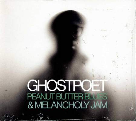
Above, both the actual CD and the front of the digipak can be seen. The image of the artist used on the front of the digipak is extremely blurred, once again contributing to the element of mystery when it comes to the image of the artist. This also links with the reverse of the digipak as a similar effect is used there, with the close-up background image. The front of the digipak follows the same colour scheme as the reverse. The actual CD print also does follows this. The monochrome colours of the background image, contrast with the white text used on the titles name. Although the majority of the artists image cannot be recognised, a small amount of his glasses can be. Ghostpoets spectacles heavily feature within his star image. This is because of their size and uniqueness. He can be seen wearing them in some other images below. This allows the target audience to recognise him because of these glasses, despite the fact that the rest of the image is much less recognisable.
Due to the image of Ghostpoet on the digipak only showing him, and not featuring anybody else, it can be easily recognised that he is a solo artist rather Ghostpoet being a name for a band. The fact that he is displayed in digipak the to be blurred and mysterious fits with his name, as he almost appears to be a Ghost upon the front of the digipak. The CD's print is split into two different designs. A vinyl image has been used on a small section of the CD print to once again give a vintage feel to the overall digipak. The track-listing has been displayed on this platform of media as well. This is something that we could consider when designing our digital pack.
Tuesday, 17 January 2012
Digital Pack Research - Analysis. (The Cads)

Here is the front of a CD Sleeve/Cover, used by The Cads when releasing their EP; Spark Up In Style. As we can see, the design is very simple using just 3 different colours. It is also rather obvious that the design has been drawn free-hand, and is some what a piece of art rather than a heavily edited photo. This fits the forms and conventions of the Indie genre. Many other bands have followed this style including Foals, whose one of many EP CD Sleeves can be seen below The Cads'. This style is something that could be considered when we begin to design our digital pack.
 In addition to this, the shapes used in the design of The Cads CD sleeve are predominantly triangles. Triangles are often associated with the Indie genre and the Hipster Scene. This could of been intentionally included within the design of the sleeve, contributing to the image of the band and allowing more of their Target Audience to identify themselves and make links with the band. It is also noticeable that the title of the EP has been spelt without any capital letters upon the front of the sleeve. In my opinion, it is highly likely that this has been done as the band may believe it goes against the 'normal', and will give a unique stance. As The Cads are an unsigned band, it will be within their interest to draw as much attention to themselves as a band and also towards their products as possible. Therefore this may further explain their choice in design as it does not explain or give any hints towards their style and genre of music, besides subtle features such as the previously mentioned iconic Indie triangles. By doing so, more people are likely to listen to their EP as they wont have disregarded them musically after they have seen their CD sleeve, if they usually do not listen to bands from the Indie Genre. This expands their potential audience.
Subscribe to:
Comments (Atom)